
Colour
Our palettes bring our brand together and help us show our personality. So, let’s finish the cube.
Core palette
Lead with crimson for major brand moments and turn to sapphire for secondary actions. Black and white are our go-to text colours; check out how we’ve matched them with the colours below.
YR Crimson
HEX D1193A
RGB 209 25 58
CMYK 0 88 72 18
Sapphire
HEX 1056BE
RGB 16 86 190
CMYK 92 55 0 25
Iris
HEX 6152D1
RGB 97 82 209
CMYK 97 82 82 82
Eary Black
HEX 171717
RGB 23 23 23
CMYK 0 0 0 91
White
HEX ffffff
RGB 255 255 255
CMYK 0 0 0 0
Secondary palette
Lead with crimson for major brand moments and turn to sapphire for secondary actions. Black and white are our go-to text colours; check out how we’ve matched them with the colours below.
Russian Violet
HEX 1D1842
RGB 29 24 66
CMYK 56 64 0 74
HEX 342C72
RGB 52 44 114
CMYK 54 61 0 55
Ruddy Blue
HEX 52A4FF
RGB 82 164 255
CMYK 68 36 0 0
Claret
HEX 8E0D3C
RGB 142 13 60
CMYK 0 91 58 44
Sea Green
HEX 09814A
RGB 9 129 74
CMYK 93 0 43 49
Crimsom
HEX FDCA40
RGB 253 202 65
CMYK 0 20 74 1
Pink lavender
HEX D4AFCD
RGB 212 175 205
CMYK 0 17 3 17
Salmon Pink
HEX FDA1A2
RGB 253 161 162
CMYK 0 36 36 1
Minty rose
HEX FFE5EA
RGB 255 229 234
CMYK 0 44 98 5
Sage
HEX CDC392
RGB 205 195 146
CMYK 0 10 8 0
Usage
Discover how colours pop and get tips on what not to do.
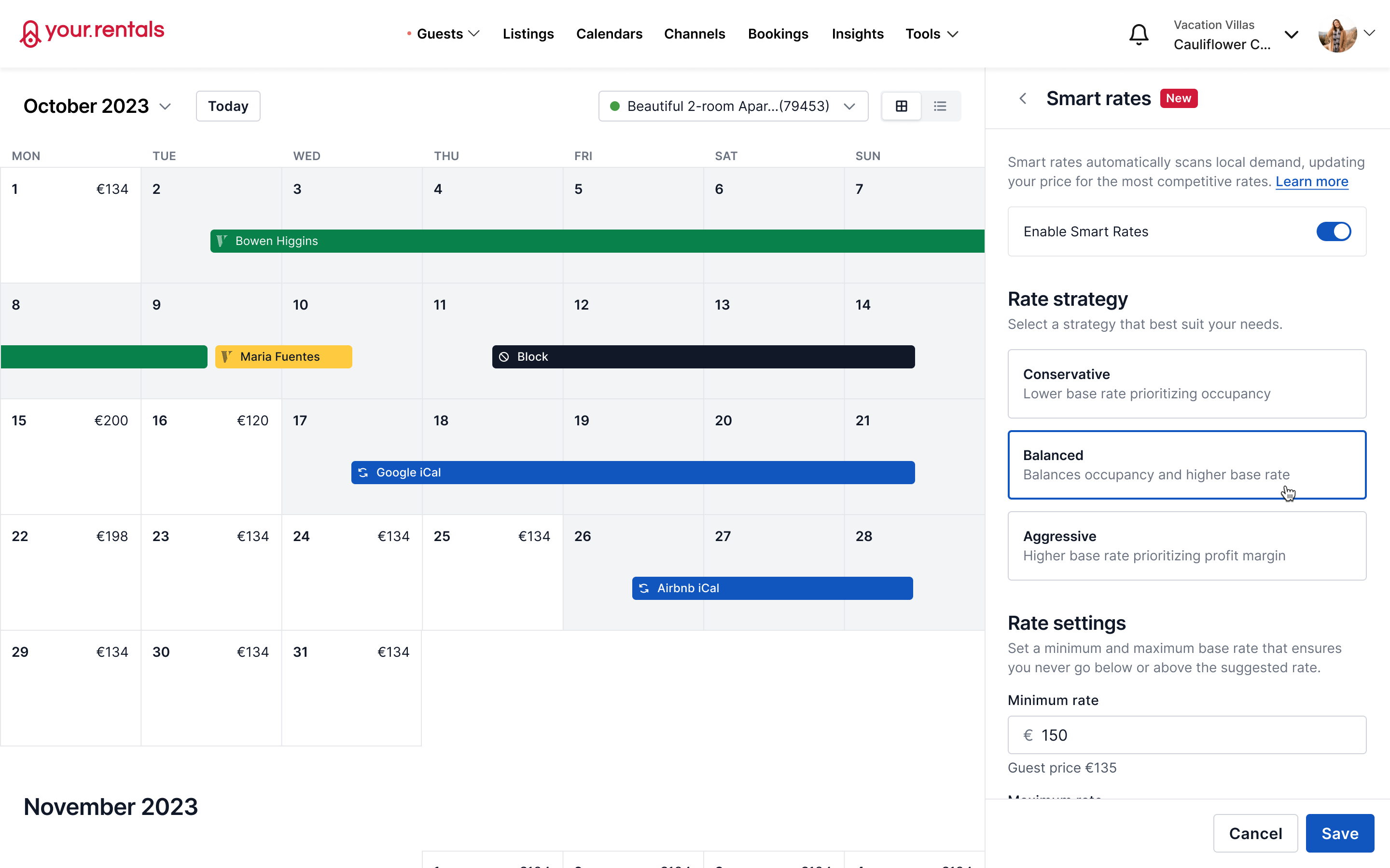




Gradient OK
Gradient OK
Some donts
Discover how colours pop and get tips on what not to do.